Authors : Marsan Ma, Nikhil Lopes, Raj Amrit, Hong Lu, Dipankar Biswas, Trent Kyono
Leadership: Iris Wang, Madhu Kurup
Recommendation and ranking systems power many of the most important experiences on large internet platforms. Yet the models that run in production are rarely the largest models we can train. They are usually compact, latency-sensitive supervised models that need to score huge candidate sets for millions of users under tight cost constraints.
That creates a practical tension:
- We want to use rich, long-term behavioral histories and modern deep learning.
- We still need millisecond-level latency for high-traffic ranking, recommendation, and bidding systems.
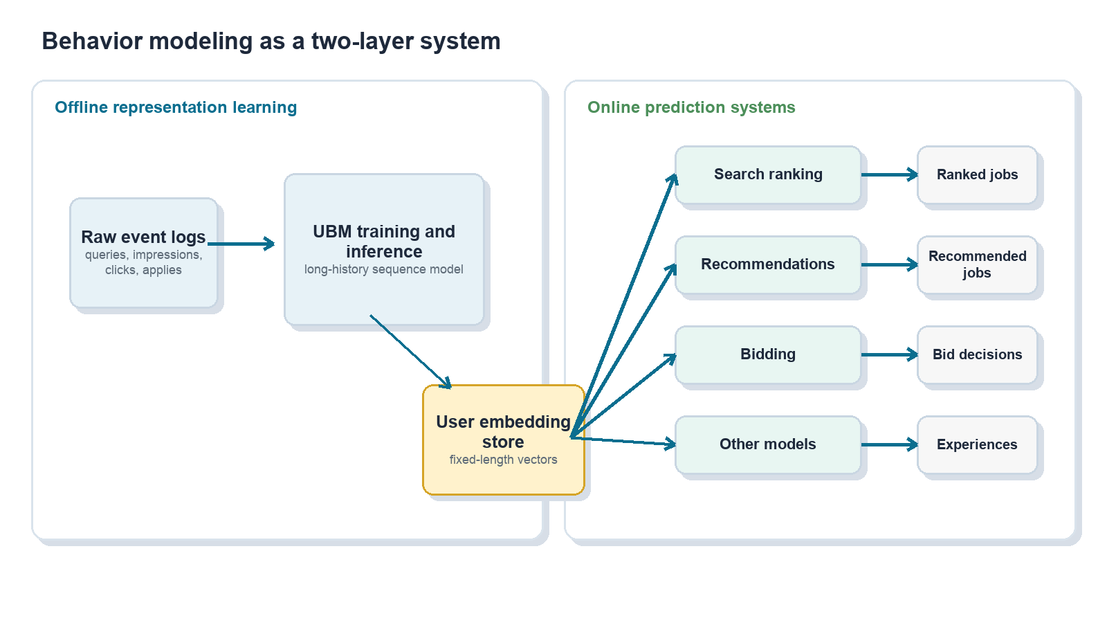
This post describes how we addressed that tension in job search by building a user behavior modeling system, or UBM, that learns from long-tail user histories offline and distills them into compact user embeddings that many online models can consume.
At a high level, UBM:
- Mines long-term user behavior with deep sequence models.
- Distills each user’s history into a fixed-length embedding.
- Makes that embedding available through a feature store.
- Lets existing production models use the embedding with minimal serving changes.
- Produces consistent multi-percent lifts across several high-traffic surfaces.
The core idea is simple: do the expensive sequence modeling once, offline, and reuse the resulting user representation many times online.
Why long-tail user behavior is hard to use directly on production
For a job platform, understanding job seekers is central to matching the right people with the right roles. A user’s history can include many signals across the hiring journey:
- Search queries, including titles, keywords, companies, and locations.
- Job impressions and clicks.
- Saves and bookmarks.
- Apply starts and completions.
- Employer responses and downstream outcomes.
In principle, this history is highly valuable. In practice, traditional tabular modeling often forces several compromises.
First, we keep fixed-length windows, such as the most recent K actions, and discard the rest. Second, we aggressively aggregate sequences into statistics such as “top title words” or “fraction of clicks in industry X.” Third, we rely on one-hot or sparse features that lose semantic similarity across titles, skills, companies, and industries.
Those simplifications can distort user intent. Consider a job seeker who once applied to civil engineering roles, later explored medical software trainer roles, and eventually settled into senior account management. A naive aggregation over title tokens might over-weight the word “software” and push the system toward software engineering recommendations, even though the user’s recent and consistent behavior points elsewhere.
At the same time, directly serving stacked sequence models over raw per-impression history did not fit our existing production infrastructure, where high-traffic systems need to score large candidate sets within strict latency and cost budgets.
We needed a system that could let large models learn from raw sequences offline, then feed a distilled representation into the compact online models that already power production traffic.
Behavior modeling as sequence modeling
We model user behavior as sequences, much like sentences in natural language processing:
- Sequences of jobs seen, clicked, saved, or applied to, with metadata such as title, location, salary, company, and category.
- Sequences of search queries and their attributes.
- Other contextual events are ordered over time.
Sequence models are useful here because they can denoise long histories, capture temporal structure, and learn semantic relationships between jobs, queries, and users. The serving constraint shapes the architecture: a large offline model reads long histories and emits a user embedding, while many small online models consume that embedding as an ordinary dense feature.
Conceptually:
Heavy sequence modeling happens offline; light scoring happens online many times.
Architecture: from raw events to user embeddings
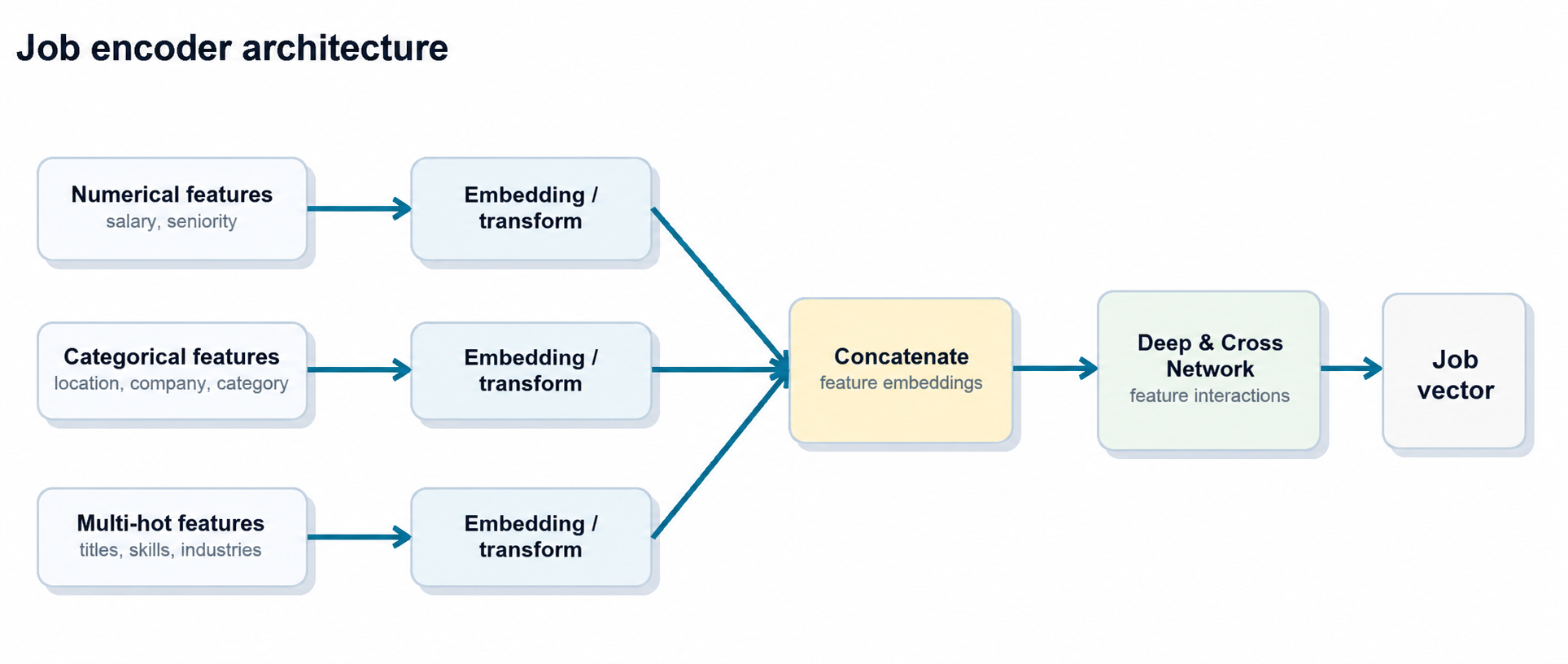
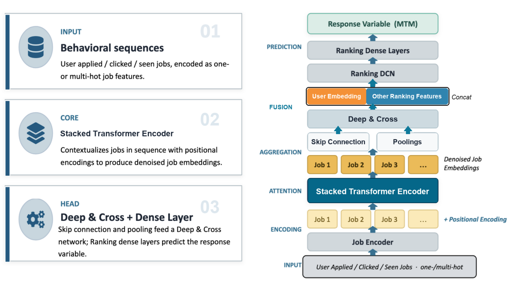
1. Encode jobs and events
The first step is to encode individual jobs and events into dense vectors. Each job contains multiple feature types:
- Numerical features, such as salary and seniority signals.
- Categorical features, such as location, job category, and company.
- Multi-hot features, such as normalized titles, skills, and industries.
Each feature type is mapped into embeddings. Those embeddings are concatenated and passed through a Deep & Cross Network, producing a compact job embedding that captures both linear and non-linear feature interactions.
The same job encoder is reused across behavior streams so that all sequences live in a consistent embedding space.
2. Build behavior sequences
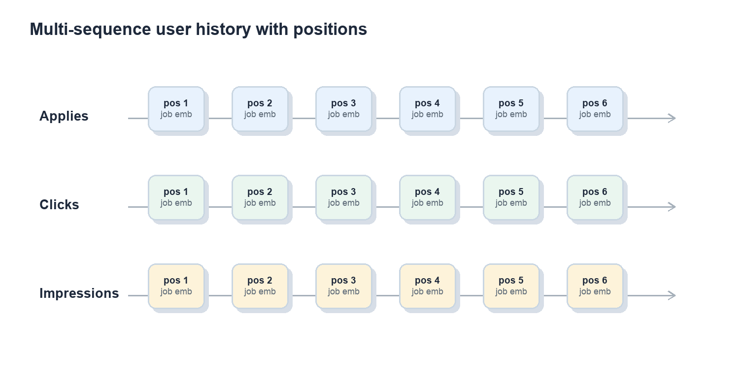
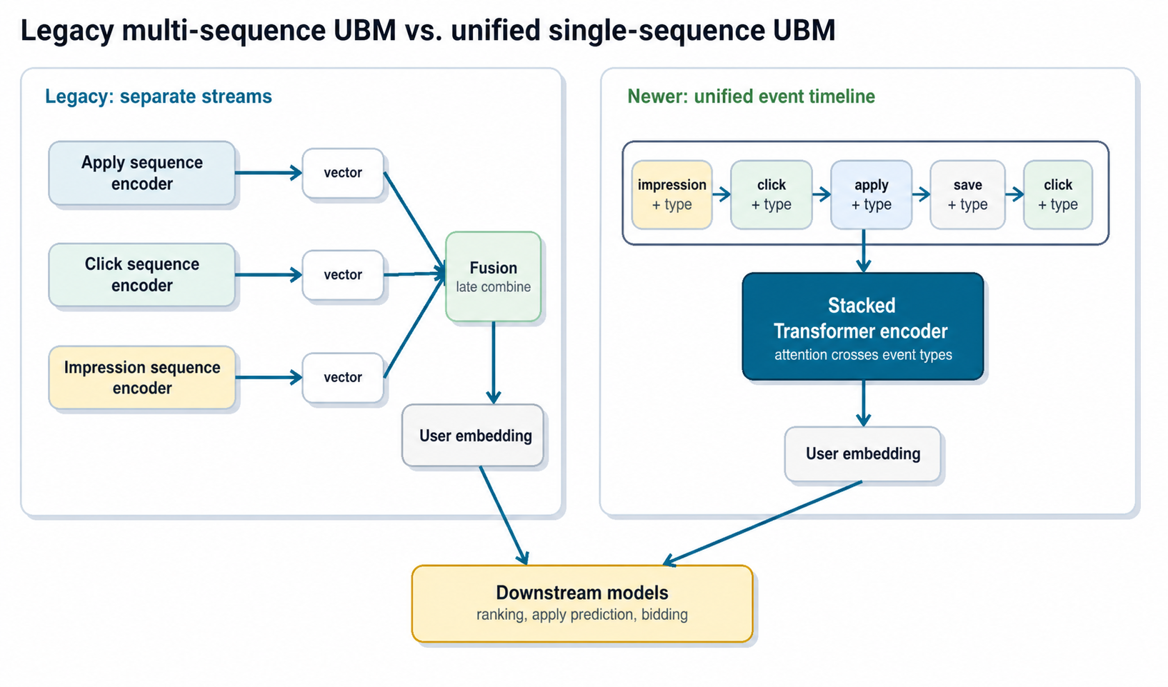
In practice, we have gone through two generations of behavior encoders: an earlier multi-sequence design and our current unified single-sequence design. In the first production version of UBM, user history was naturally treated as multi-channel: each action type was represented as a separate time-ordered sequence of job embeddings:
User U
Apply: [job_a1, job_a2, …, job_aN]
Click: [job_c1, job_c2, …, job_cM]
Impression: [job_i1, job_i2, …, job_iK]
Each sequence includes positional encodings so the model can reason about recency, order, and temporal patterns instead of treating user history as an unordered set.
3. Denoise long histories with self-attention
Long histories are noisy. People explore, change direction, compare roles casually, or click jobs that are only loosely relevant. The sequence model needs to separate durable intent from one-off behavior.
In the multi-sequence version, each action-specific sequence is passed through multi-head self-attention or transformer encoder blocks. The model re-weights each event in the context of the full sequence. Consistent patterns are amplified; isolated or off-topic events are down-weighted.
After attention, we pool the denoised sequence and combine it with skip connections from the original embeddings. Another Deep & Cross block then produces a per-sequence embedding, such as an “apply history embedding” or “click history embedding.”
4. Evolve from multi-sequence fusion to a unified event timeline
Different actions carry different information:
- Apply history is strong but sparse.
- Click and impression history is weaker but dense, and captures exploration.
- Saves, ignores, and other actions add nuance.
The first generation of UBM learned separate encoders for different behavior streams, then concatenated or fused their outputs into a single user history embedding. That design worked well: the final vector was expressive enough to capture long-term structure, but small and fixed-length enough for downstream models to consume cheaply.
More recently, we found that we could simplify the architecture and improve results by moving to a single-sequence design:
- Merge all events, such as applies, clicks, impressions, and saves, into one unified timeline sorted by time.
- Add an explicit event-type embedding to each step so the model knows whether the event was an apply, click, impression, or another action.
- Let one transformer stack attend over the unified sequence instead of maintaining separate stacks per action type.
This design has two practical advantages.
First, it simplifies the model and pipeline. There is one sequence encoder to train, maintain, and monitor. Adding a new event type becomes a matter of adding a new event-type representation, rather than wiring a new encoder into the model and downstream feature pipeline.
Second, it gives attention layers direct access to cross-event patterns. The model can learn transitions such as “impression to click to apply” inside one timeline, rather than relying on separate per-action summaries that are fused only after each stream has already been compressed. This also follows a broader trend in modern sequence modeling: expose as much raw event data as possible and minimize hand-crafted aggregation, so the model can discover these patterns directly from first-hand signals.
In a large downstream model, switching from the legacy multi-sequence UBM to the unified single-sequence behavior model roughly doubled the relative ROC-AUC gain over the no-UBM control model on several targets. For example, in one experiment the relative ROC-AUC improvement over control on the CTR target went from about +1.6% to +3.5%, and on the apply-start target from about +1.3% to +2.3%, using the same downstream architecture and data.
Training and serving at scale
Offline training
Training the offline sequence model is challenging because each user can interact with hundreds of jobs, and each job can have many attributes. Naively materializing all joins between users, events, and job attributes would inflate the training table by hundreds of times (each example references hundreds of jobs), turning a TB-scale dataset into PB-scale. Keeping jobs in a side table and doing cached GPU lookups instead cuts the effective data volume by hundreds of times and gives us over 100× faster training in internal benchmarks, since dense array lookups are exactly what GPUs are good at.
The offline model is trained on months of historical data and updated periodically; in the unified single-sequence version, the same pipeline emits one chronologically sorted event stream per user, with event-type features attached to each step.
Daily embedding refresh
The model itself does not need to be retrained every day, but user behavior changes continuously. To keep embeddings fresh:
- We run daily batch inference with the latest user histories.
- The model remains fixed during that refresh cycle.
- Input sequences slide forward as new events arrive.
- Updated embeddings are written to a feature store for downstream consumers.
In practice, the offline model can remain useful for months between retraining cycles, while daily inference keeps user representations current enough for production ranking and recommendation.
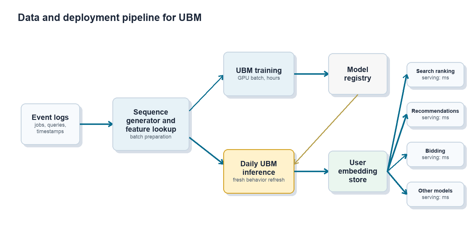
Online consumption by many models
Downstream ranking, recommendation, and bidding models treat the UBM embedding as one more input feature. This is the key to make the system deployable:
- Production models do not need to be rewritten as transformers.
- Existing tabular models can be retrained with an additional dense feature.
- Online serving cost changes only modestly because the heavy sequence modeling has already happened offline.
This “one producer, many consumers” pattern also improves consistency. Multiple surfaces share a common view of user intent instead of each team rebuilding its own local behavior features.
How much does this help?
Offline model quality
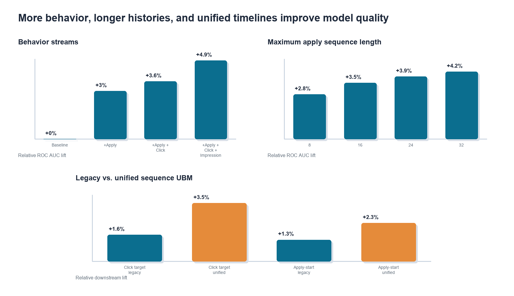
On an offline apply-prediction benchmark, we compared a strong baseline model with traditional features against the same model augmented with UBM embeddings. Adding more behavior streams improved ROC AUC consistently in the multi-sequence version:
- Apply sequence only: roughly +3.0% relative ROC AUC.
- Apply + click sequences: roughly +3.6%.
- Apply + click + impression sequences: roughly +4.9%.
We also found that longer histories helped. Extending maximum sequence length from 8 to 32 events showed monotonic gains, with diminishing returns as the sequence length increased. While figure 7 only shows this early sweep up to 32 steps, our current production UBM models already use sequence lengths up to 256 events, and we are actively exploring longer contexts as we scale up infrastructure.
The newer unified single-sequence model kept the same operational pattern but improved downstream lift by letting the model attend across event types directly:
- Click-based target: roughly +1.6% with legacy multi-sequence UBM, improving to about +3.5% with unified single-sequence UBM.
- Apply-start rate: roughly +1.3% with legacy multi-sequence UBM, improving to about +2.3% with unified single-sequence UBM.
These results support two intuitions:
- More behavior channels matter because different actions contain complementary signals.
- Long-tail history matters because the model can learn to denoise behavior instead of relying on hand-truncated windows.
- Event order across behavior types matters because job search intent often emerges through transitions, not isolated action streams.
Impact on high-traffic job surfaces in production
The more important question is what happens in production.
Because the same embedding can be reused across many models, the impact compounds across surfaces. In production experiments, adding UBM features produced consistent gains in recommendation quality, apply efficiency, and monetization metrics.
| Surface | Relative lift |
|---|---|
| Jobseeker Email Recommendations | Application rate +5.24% |
| Jobseeker Homepage recommendations | Application rate +2.04% |
| Employer Resume Search | NDCG@10 +2.89% |
| Employer Candidate Recommendations | Employer Acceptance rate +1.64% |
Across downstream models, the UBM embedding is often ranked as a top-1 or top-2 feature by importance, consistent with the observed business impact.
Extending beyond user behavior
Once the infrastructure existed for user behavior, the same pattern became useful elsewhere in the marketplace.
Employer behavior modeling applies analogous techniques to employer interactions with candidates. Those embeddings can feed sourcing, ranking, and bidding systems.
Knowledge graph and item embeddings offer another extension. Graph-based methods can encode relationships between jobs, companies, skills, and users, and those representations can be combined with sequence-based UBM and employer behavior embeddings.
The broader pattern is reusable: train richer representation models offline, distill them into compact embeddings, and expose them as shared features for production systems.
Design trade-offs and lessons learned
The offline-online split is worth it
Splitting the model into a heavy offline encoder and light online consumers sacrifices some optimality. For example, attention is not conditioned on the exact target job at scoring time. But the latency and cost benefits are large, and the resulting system is much easier to deploy across many production models.
Sequence modeling beats hand-built aggregates
Raw sequences across behavior types are more expressive than handcrafted features such as “percentage of clicked jobs in industry X.” The model learns which events to emphasize, which to down-weight, and how behavior changes over time. The single-sequence design extends this lesson: preserving cross-event order can be more valuable than summarizing each action stream independently and fusing later.
Staleness is manageable, but must be monitored
Embeddings do not need to be retrained every week, but they do need operational monitoring. Useful diagnostics include offline ROC AUC and log loss, online KPIs, feature distribution checks, and day-over-day cosine similarity of user embeddings to catch pipeline anomalies.
Centralized embeddings reduce duplicated effort
A shared embedding producer lets multiple product teams benefit from the same representation learning investment. It also reduces duplicated local behavior features and makes user understanding more consistent across surfaces.
Where we are heading next
UBM is now a foundation layer for many ranking, recommendation, and bidding systems, but several directions remain active:
- Richer unified sequence modeling across search, browse, apply, and off-platform signals.
- Joint user-employer modeling so both sides of the marketplace can be represented together.
- Tighter integration with retrieval and approximate nearest-neighbor search.
- Better use of behavior embeddings as context for large language models in hiring workflows.
- Standardized tooling and observability so downstream teams can adopt embeddings safely.
The goal is straightforward: use long-term behavioral data to make job search and hiring more relevant, while staying within the real-world constraints of large-scale production systems.
